
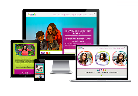
More than half of all website visits now happen on a phone, which means the mobile version of your site isn’t a backup plan, it’s the main event. If your website was designed for desktop first and squeezed onto mobile as an afterthought, you’re likely losing visitors before they ever see what you offer.
What Mobile Visitors Actually Experience
Tiny text that requires zooming, buttons that are too close together to tap accurately, and slow-loading images all push mobile visitors to hit the back button within seconds. Once they leave, they rarely come back to give your business a second chance.
What Mobile-First Design Actually Looks Like
- Navigation that’s simple enough to use with one thumb, without a maze of dropdown menus.
- Text and buttons sized for tapping, not clicking, so nothing feels cramped or accidental.
- Images and fonts that load quickly, even on a slower connection.
- A clear call to action that’s visible without endless scrolling.
Designing for mobile first doesn’t mean your desktop site suffers. It means every version of your website is built around how people actually behave, which is scrolling through their phone in line at the grocery store or between meetings.
Not sure how your website performs on mobile? Contact us today and we’ll take a look together.